2025's Color of the Year with a Splash of Summer
Are you planning a website, or simply curious about what colors will define our visual world in 2025? Then this post is for you! In this article, I’m sharing some of my thoughts on this year’s color trends – especially because the official Color of the Year is particularly close to my heart. I always feel energized when I explore new inspirations in the world of design and fashion, and this year’s color has quickly become a personal favorite.
Planning Your Palette? Discover 2025's Colors & My Personal Favorites
You’ve surely experienced how a well-chosen shade can powerfully affect your mood and impressions – and as I detailed in my previous article (The Power of Color in the Digital Space), it’s no different for websites! Today, we’re focusing on a truly special color, the Pantone Color of the Year for 2025, the warm and inviting Mocha Mousse (PANTONE 17-1230 TCX), and we’ll also see what freshness the summer trends are bringing.
While some might view the “Color of the Year” as merely a passing trend, I see Pantone’s choice as having a much deeper meaning: it’s a subtle reflection of the general moods, aesthetic directions, and feelings shaping our world. These influences weave through fashion, interior design, and, of course, the digital spaces where we create and connect.
In this post, we’ll explore together what the “Color of the Year” concept truly entails, why I find the Mocha Mousse shade so appealing, and how it intertwines with the latest summer color trends. I’ll show you how you can draw ideas from this rich palette without your end result becoming a cliché. Join me, and get inspired by the wonderful world of colors!
What Exactly Is the Pantone Color of the Year, And Why Does It Matter to You?
Every year, the team at the Pantone Color Institute takes a close look at global trends across art, fashion, and even new technologies and lifestyles, to capture the essence of the current period. From this rich bouquet of inspiration, they select that one particular shade that becomes the defining color of the year.
And is it just a passing whim? Well, the Color of the Year officially wears the crown for one year, but experience shows that a truly well-chosen shade (remember Living Coral or Ultimate Grey?) can stay with us for years and become an integral part of our everyday lives.
The Magic of Mocha Mousse: A Mug of Warmth in the Digital Space
The 2025 choice, Mocha Mousse (PANTONE 17-1230 TCX), is a truly special shade. Imagine a steaming, creamy cup of coffee, a square of fine chocolate – this color brings exactly that warmth, comfort, and down-to-earth elegance. It’s a rich, deep brown that is simultaneously calming and sophisticated.
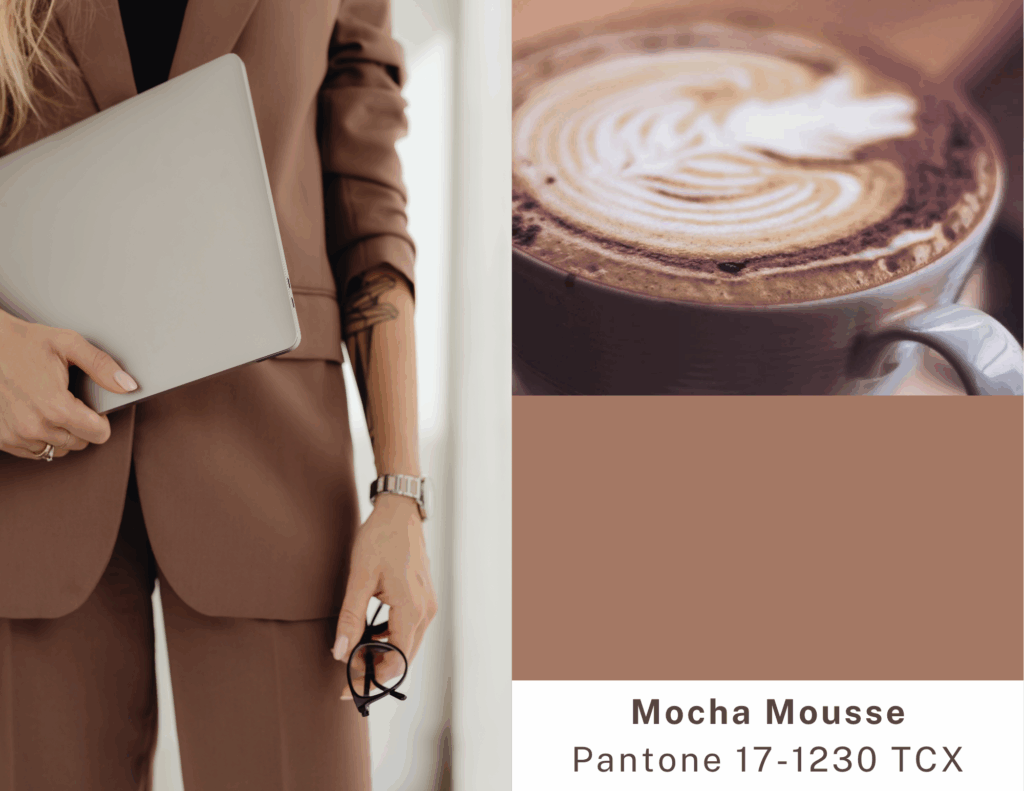
For me, this color embodies naturalness, stability, and a kind of quiet luxury. Precisely the values that many brands want to convey – and which a well-designed website can visually support.
How Does Mocha Mousse Appear in Web Design? (And Why Do I Love It?)
As a web designer, my mind immediately started buzzing with ideas on how to incorporate this beautiful brown into my work. I think Mocha Mousse is brilliant:
As a background color: It can provide a warm, inviting base without overpowering the content. It works particularly well on clean, minimalist pages.
For highlights: A button, icon, or text snippet in Mocha Mousse can add elegance and focus.
In combinations: And here’s where the real fun begins! Pantone doesn’t just designate the color itself; they also curate inspiring palettes around it.
Inspiring Palettes: When Mocha Mousse Finds Its Companions
Pantone has introduced several official color palettes centered around Mocha Mousse, offering wonderful inspiration. Before we dive in, an important note: the digital representation (RGB/Hex) of Pantone’s textile (TCX) colors doesn’t always perfectly match the original shade, as they are different color systems. If you want to see these colors accurately and their various codes, or even discover more shades, I recommend visiting the official Pantone Color Finder page. The (parenthesized) hex codes mentioned here are good approximations to give you a visual idea.
Let’s look at a few palettes that particularly caught my eye:
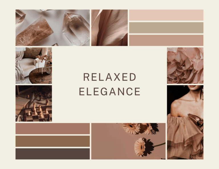
Relaxed Elegance: This palette combines the tranquility of nature with understated elegance. Here, Mocha Mousse (PANTONE 17-1230 TCX) (approx. #A47864 )* is paired with earthy and neutral shades like the soft Cannoli Cream (PANTONE 11-4302 TCX) (approx. #F1F0E2)* or the warm sandy Safari (PANTONE 15-1116 TCX) (approx. #BBAA91)*. Perfect for a premium lifestyle brand or a blog with a cozy atmosphere.
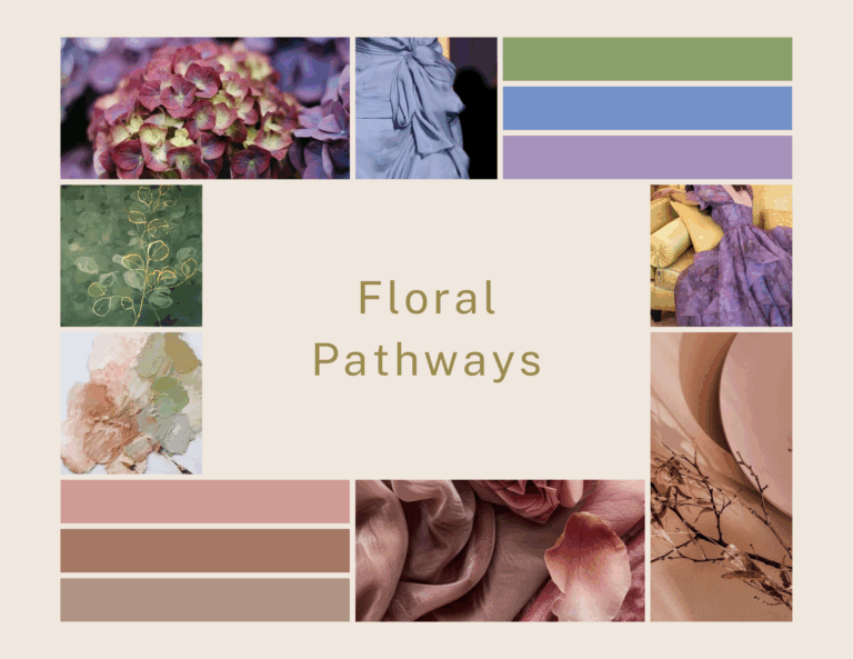
Floral Pathways: This palette evokes the softer, floral side of nature. Mocha Mousse (PANTONE 17-1230 TCX) meets delicate shades here, such as the powdery Rose Tan (PANTONE 16-1511 TCX) (approx. #D19C97)* or the fresh Willow (PANTONE 16-0632 TCX) (approx. #9A8B4F)*. Ideal for wellness brands or anything that aims to emphasize naturalness and subtlety.
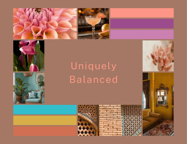
Uniquely Balanced: A truly unique palette that pairs the warm Mocha Mousse (PANTONE 17-1230 TCX) with more vibrant, cooler tones, for example, an energetic Blue Curacao (PANTONE 15-4825 TCX) (approx. #33BECC)* or a spicy Spicy Mustard (PANTONE 14-0952 TCX) (approx. #D8AE48)*. I recommend it for bolder brands that want to stand out.
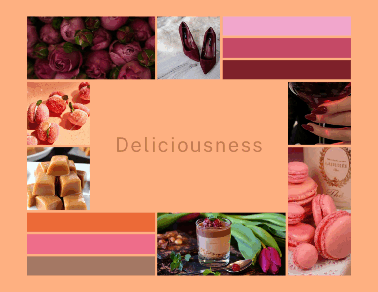
Deliciousness: As its name suggests, this is a mouth-watering palette filled with sweet and spicy tones. Mocha Mousse (PANTONE 17-1230 TCX) forms tasty combinations here with colors like the candy-like Bonbon (PANTONE 15-2213 TCX) (approx. #F1A6CC)* or the golden-brown Caramel (PANTONE 16-1439 TCX) (approx. #C37C54)*. Ideal for food industry brands or any project that emphasizes indulgence.
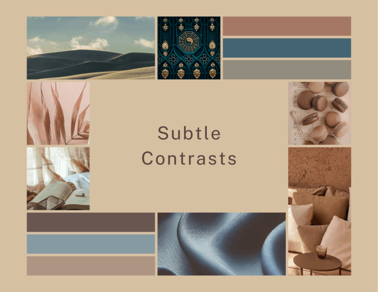
Subtle Contrasts: This palette is built on fine contrasts and the elegant harmony of neutral yet characterful shades. Here, Mocha Mousse (PANTONE 17-1230 TCX) (approx. #A47864)* is paired with sophisticated colors such as the deep, bluish-green leaning Tapestry (PANTONE 18-4417 TCX) (approx. #436573), the earthy, neutral Laurel Oak (PANTONE 17-0610 TCX) (approx. #918C7E), or the warm, friendly Warm Taupe (PANTONE 16-1318 TCX) (approx. #AF9483)*. It’s a perfect choice for clean, modern identities where understated yet characterful sophistication is the goal.
Note on hex codes: Hex codes marked with an asterisk () are approximate values.*
Beyond the Color of the Year: Inspiration for Every Season
It’s important for you to know that Pantone doesn’t stop at the annual color! They also compile fresh palettes for every spring/summer and autumn/winter season, often drawing inspiration from the fashion weeks (like New York and London). These Pantone Fashion Color Trend Reports define the most significant shades of the current season.
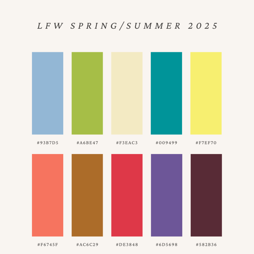
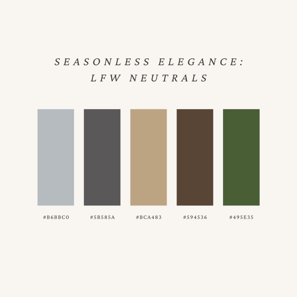
For instance, according to the London Fashion Week Spring/Summer 2025 forecasts (which are available on the Pantone website), cheerful, energetic colors will take center stage, such as the sun-kissed, warm Yellow Jasper (PANTONE 12-0719 TCX), a radiant golden yellow, or the refreshing, light Pear Sorbet (PANTONE 11-0615 TCX), a soft yellowish-green. Additionally, the rich, warm Cocoa (PANTONE 19-1119 TCX) – which also belongs to the brown shade family and is similar to Mocha Mousse in its mood and warmth – plays an important role among the seasonless core shades, indicating the lasting popularity of earthy tones.
This means that alongside Mocha Mousse, you have plenty of other opportunities to play with colors, and you’ll always find fresh inspiration!
Web Design, Fashion, Interior Design: The Visual World Breathes Together
The question often arises whether it makes sense for me as a web designer to follow fashion or interior design trends. My answer is a clear yes! These fields are much more closely interconnected than you might think at first. A color or style that appears on the runway will soon be reflected in your home textiles and, eventually, in the branding of your favorite websites.
Of course, it’s not about adopting everything wholesale. The key is conscious inspiration: seeing what resonates with your own style and deciding if you’d like to refresh your brand identity with unique, personalized solutions.
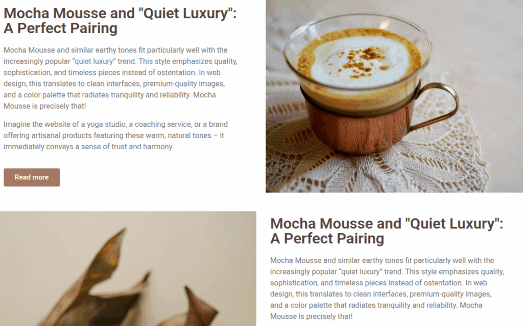
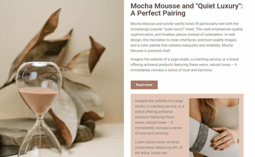
Mocha Mousse and "Quiet Luxury": A Perfect Pairing
Mocha Mousse and similar earthy tones fit particularly well with the increasingly popular “quiet luxury” trend. This style emphasizes quality, sophistication, and timeless pieces instead of ostentation. In web design, this translates to clean interfaces, premium-quality images, and a color palette that radiates tranquility and reliability. Mocha Mousse is precisely that!
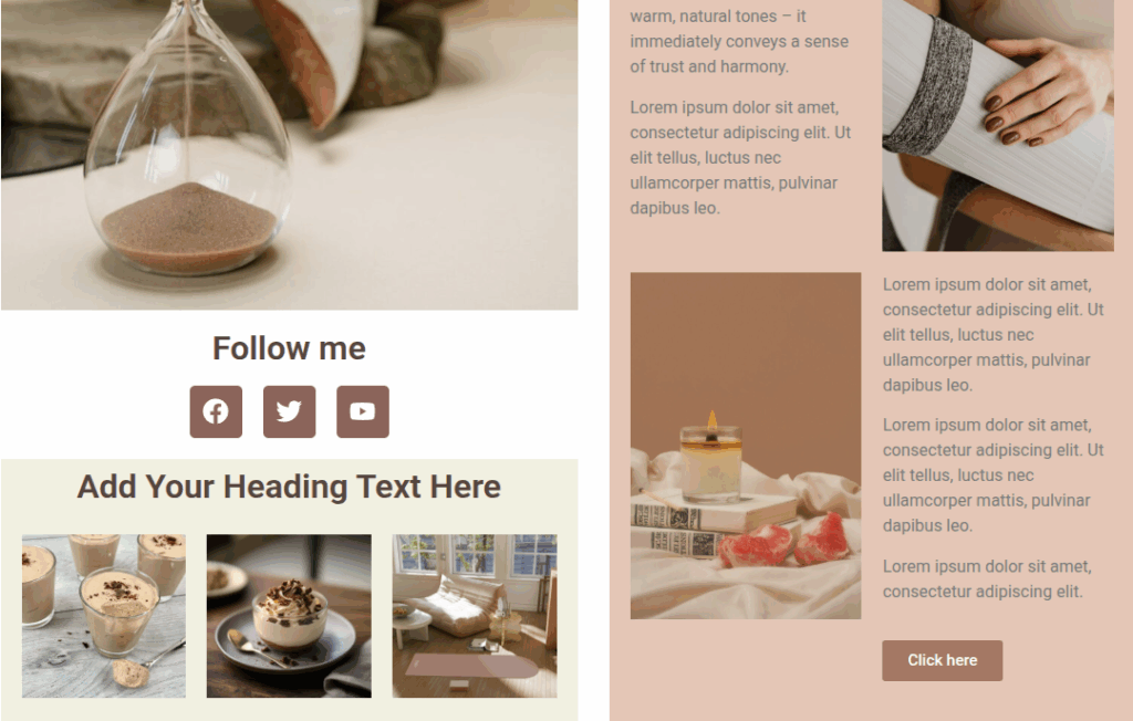
Imagine the website of a yoga studio, a coaching service, or a brand offering artisanal products featuring these warm, natural tones – it immediately conveys a sense of trust and harmony.
The Impact of Colors: Why Paying Attention to Trends is Worthwhile
You might be thinking now, “Okay, this is all well and good, but I just want a good website.” And you’re right! But a “good” website today is much more than just that.
The conscious use of color, as I explained in my previous article (The Power of Color in the Digital Space):
Strengthens your brand message: It helps tell who you are and what you represent.
Improves user experience: It makes the site more pleasant and clearer to navigate.
Evokes emotions: It can create a deeper connection with your visitor.
And yes, it can even increase conversions!
Final Thoughts: Inspiration and Uniqueness in Color Selection
The Pantone Color of the Year, like Mocha Mousse, or seasonal trends can provide a great starting point and inspiration. But the most important thing is always to choose colors that are truly in harmony with your brand’s personality, message, and goals.
Don’t be afraid to experiment, draw ideas from the wider world, but always add your own unique perspective! Mocha Mousse is a wonderfully versatile color that can bring warmth, comfort, and elegance to the digital space. I hope it has inspired you too!
If you’re curious about how you could apply these color psychology principles and trends to your own website, I’d be happy to help. Feel free to reach out for a chat!