
What Your Website's Palette is Really Saying
Your website’s color scheme isn’t just a pretty design element – it’s a powerful messenger. It sets the mood, communicates your brand’s vibe, and can even nudge visitors towards making a decision. In 2025, where visual experience is absolutely key to your online presence, choosing your colors wisely is more important than ever.
In this article, I’ll dive into how colors tap into human emotions and behaviors, and how you can use this knowledge to make your website not just beautiful, but strategically effective.
Color Psychology in Web Design: Harnessing the Might of First Impressions
1. Why is Color Choice So Crucial for Your Website?
Visitors form an impression of your website in mere seconds – and colors play a massive role in that initial judgment. A well-chosen color palette can:
Evoke specific emotions (e.g., calmness, energy, trustworthiness).
Position your brand (e.g., premium, friendly, eco-conscious).
Direct attention (e.g., to call-to-action buttons, or CTAs).
2. How Do Colors Impact Perception and Decision-Making?
Color psychology isn’t just about feelings; it seriously influences user decisions. Your website’s colors can unconsciously sway whether someone clicks a button, trusts your brand, or feels a sense of urgency about your offer.
For example:
Blue – Evokes feelings of trust and stability. That’s why you’ll often see it on financial or healthcare sites where reliability is paramount.
🎨 Hex: #1F3A93, #A3D5FFRed – Instantly grabs attention, conveying excitement and urgency. Perfect for compelling CTA buttons or highlighting special offers.
🎨 Hex: #FF1A1A, #990000Yellow – The color of cheerfulness, optimism, and openness. A great pick for friendly, energetic brands aiming for a positive vibe.
🎨 Hex: #FFD700, #FFF9C4Green – Suggests nature, freshness, and health. Ideal for wellness, eco-conscious, or organic product websites.
🎨 Hex: #04A777, #98FF98Purple – Often associated with luxury and spirituality. It can be a powerful tool for premium services or exclusive offers.
🎨 Hex: #CBAACB, #45245CBlack / White / Grey – Represent sophistication, cleanliness, and timeless elegance. A common choice for minimalist, modern web design.
🎨 Hex: #FAFAFA, #333333, #7A7A7A
3. Which Colors Can Influence Your Visitors' Decisions – Getting Them to Click, Stay, or Buy?
Colors subconsciously tell users what’s important, urgent, trustworthy, or calming on your site.
For CTA buttons – Use a contrasting, vibrant color (like red, orange, or green, depending on the desired emotion).
For backgrounds – Keep it neutral and supportive of readability (e.g., off-white or light grey).
For brand highlighting – Use a unique brand color that stands out from competitors.
4. Web Design + Marketing: Syncing Your Colors with Your Goals
Don’t just ask if a color is “pretty.” Instead, ask yourself these three questions:
What do I want to communicate? (Calmness, energy, premium quality?)
Who is my target audience? (Women, men, young, old, B2B, B2C?)
What impact do I expect? (Purchases, contact inquiries, sign-ups?)
💡 When your branding, marketing, and UX (User Experience) are aligned, your colors will powerfully reinforce your message.
5. Colors in Action Across Industries (Examples)
Wellness, Yoga: Earthy tones, powdery shades, pastel hues.
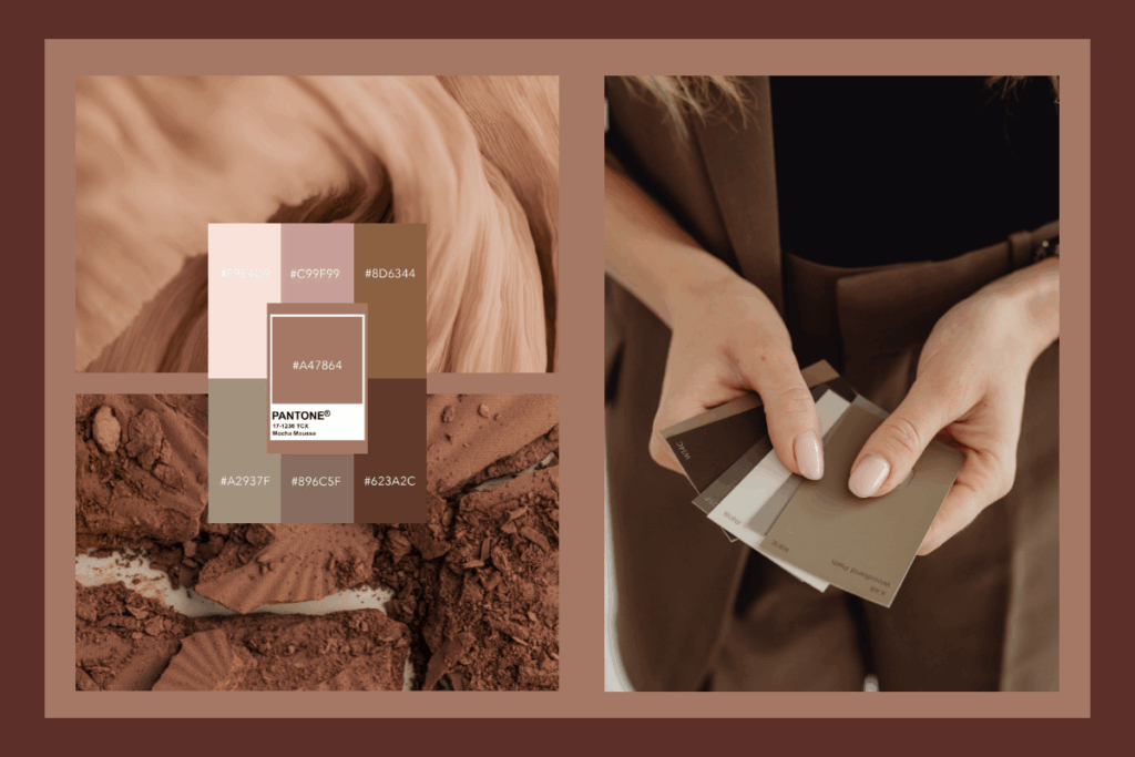
🎨 E.g., Mocha Mousse, Pale Pink (#F7E6E1)Tech / Financial Services: Dark blue, grey, light blue.
Fashion / Luxury / Cosmetics: Black, gold, deep purple.
Brands for Kids: Bright, cheerful colors – orange, blue, yellow.
6. The Color of the Year 2025 – A Sneak Peek:
Expect a warm, nature-inspired tone. This kind of color works exceptionally well for lifestyle, coaching, and wellness brands. Its softness and human-centric feel build trust and create a harmonious experience.
7. How to Keep Your Color Palette Timeless in 2025 and Beyond?
Don’t build your entire palette solely on fleeting trend colors – make it timeless with neutral or natural base shades.
Create alternative color palettes for both light and dark modes (super important for user preference!).
Use a color contrast checker (like WebAIM Contrast Checker) to ensure your content is easily readable for all visitors.
Summary: Conscious Color Use for a Stronger Brand
Choosing colors for your website is far more than an aesthetic decision – it’s a strategic tool that influences how your visitors feel and act. Well-chosen colors will:
Strengthen your brand message.
Support a positive user experience.
And can significantly boost your conversions.
📌 Don’t be afraid to test, but always have a conscious strategy behind your design choices – your colors are always talking. The only question is, what are they saying about you?
Ready to Make Your Colors Speak Volumes?
Taking these insights and translating them into a palette that truly works for your brand and goals is the exciting next step. It’s where thoughtful strategy meets creative execution to build a truly impactful online presence, ensuring your message isn’t just seen, but felt.
If you’re wondering how to apply these color principles to your own website, I’m here to help. Feel free to reach out for a friendly chat!