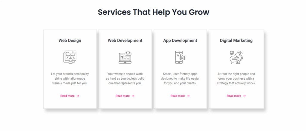
How to Create Focus and Elegance on Your Website with Conscious Use of Space
Have you ever thought that in design, sometimes the most effective element isn’t what we add, but what we consciously leave out? In a digital world filled with a constant flow of information and visual noise, silence and space have become a true luxury. This silence and space is what we call white space (or negative space) in design.
Many tend to view it as “empty,” unused territory, but in reality, it’s one of our most important and impactful visual tools. It’s important to clarify that it doesn’t necessarily have to be white – it can be any color, texture, or even an image background – the essence is that it contains no active design elements.
In this post, I’ll show you why white space is crucial and how you can use it to make your website more elegant, readable, and effective.
The "Breathing Design": How White Space Creates Harmony and Calm
The primary role of white space is to give a visual “pause,” a rest for the eyes and the mind. A cluttered, information-overloaded interface can create a sense of stress and confusion, leading visitors to easily abandon the page.
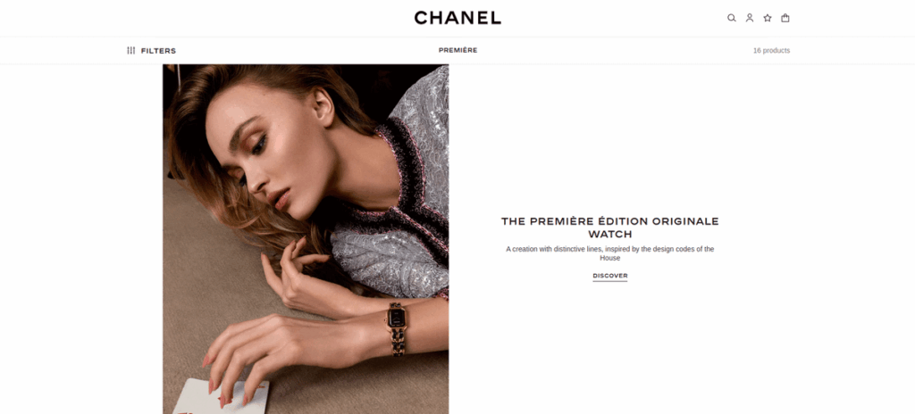
The Feel of “Quiet Luxury”: Have you ever noticed how premium, luxury brands arrange their products in their stores? There’s no clutter; each item is given its own space and attention. This ample space radiates confidence, quality, and exclusivity. The same principle applies to web design. The conscious use of white space helps create that sophisticated, clean aesthetic that is a hallmark of quality brands.
Separating Content Blocks: White space helps the eye to break down the page into logical units. It subtly separates images, texts, and different sections from each other, making it much easier for the visitor to understand the structure and content hierarchy.
Focus and Guidance: Gently Nudging the Visitor's Gaze
Besides creating calm, white space is also an extremely effective tool for directing attention. It acts like an invisible spotlight, guiding the gaze to the most important elements, all done subtly by giving them room to stand out in the design.
Highlighting the Main Message and CTA: The more space an element (like a button or a headline) has around it, the more weight and emphasis it gains. If you want your visitors to click a “Contact Me” button, don’t crowd it with other distracting elements. Give it room to “breathe,” and the attention will naturally be drawn to it.
The Art of Readability: Have you ever read a text where the lines and letters were almost touching? It can be quite tiring, can’t it? The appropriate distance between lines (line-height), the space between paragraphs, and the margins around the text are all part of white space. Their conscious adjustment can dramatically improve text readability and the overall experience of comprehension.
The Two Faces of White Space: Active and Passive Space in Design
This is a lesser-known but very exciting aspect. We can divide white space into two main types:
Passive White Space: This is the large, seemingly empty area, such as the wider space between text bodies or the side margins. Its primary purpose is to create overall spaciousness, a calm impression, and to improve readability.
Active White Space: This is the consciously composed space created to draw attention to a specific element or to create a visual connection between elements. Think of a logo with a large space around it, or two images connected by the space between them. Active white space is intentional and purposeful – a true design tool.
When we think of a premium design, it’s usually the masterful use of active white space that truly catches our eye.
How to Apply It Well? 3 Simple Principles for Conscious Use of Space
You don’t have to be a graphic designer to apply the basic principles of white space. Here are three simple aspects to pay attention to:
Think in Margins & Padding: Don’t be afraid to increase the distance between elements and from the edges of the page. Experiment with giving individual sections more internal space (padding), which instantly creates a more professional look.
Break Up Long Texts: A single, huge wall of text can be intimidating. Use shorter paragraphs, lists, quotes, and images to break up the text. Each break gives the reader a small visual pause.
Minimalism is Not Emptiness: The goal is not to have little content on your page, but for the existing content to be arranged logically and spaciously. Every element should have a purpose and a place. Anything that doesn’t add to the message or the user experience is likely unnecessary to display.
Conclusion: The Secret to Quiet Elegance
The conscious use of white space is one of the most subtle yet impactful tools of modern and effective web design. It’s not a luxury, but a fundamental element that:
Radiates calm and professionalism.
Improves readability and user experience.
Helps to direct attention to your most important messages.
The next time you visit a website or plan your own, consciously observe the space between the elements. You will see that true elegance lies in how silence subtly guides the eye and allows the essence to shine through.
Would You Like Your Website to Radiate Harmony?
If you’d like a clean, elegant, and consciously designed online presence where every element is in its place and the design truly serves your goals, feel free to reach out! Together, we can create that harmonious digital space worthy of your brand.